Prism account analytics
About
Understanding your vehicle activity and trip metrics is always useful. Prism's analytics feature lets you view detailed vehicle activity and trip information. Tracking these metrics helps with fleet utilisation, route optimisation, and planning.
How to access this feature
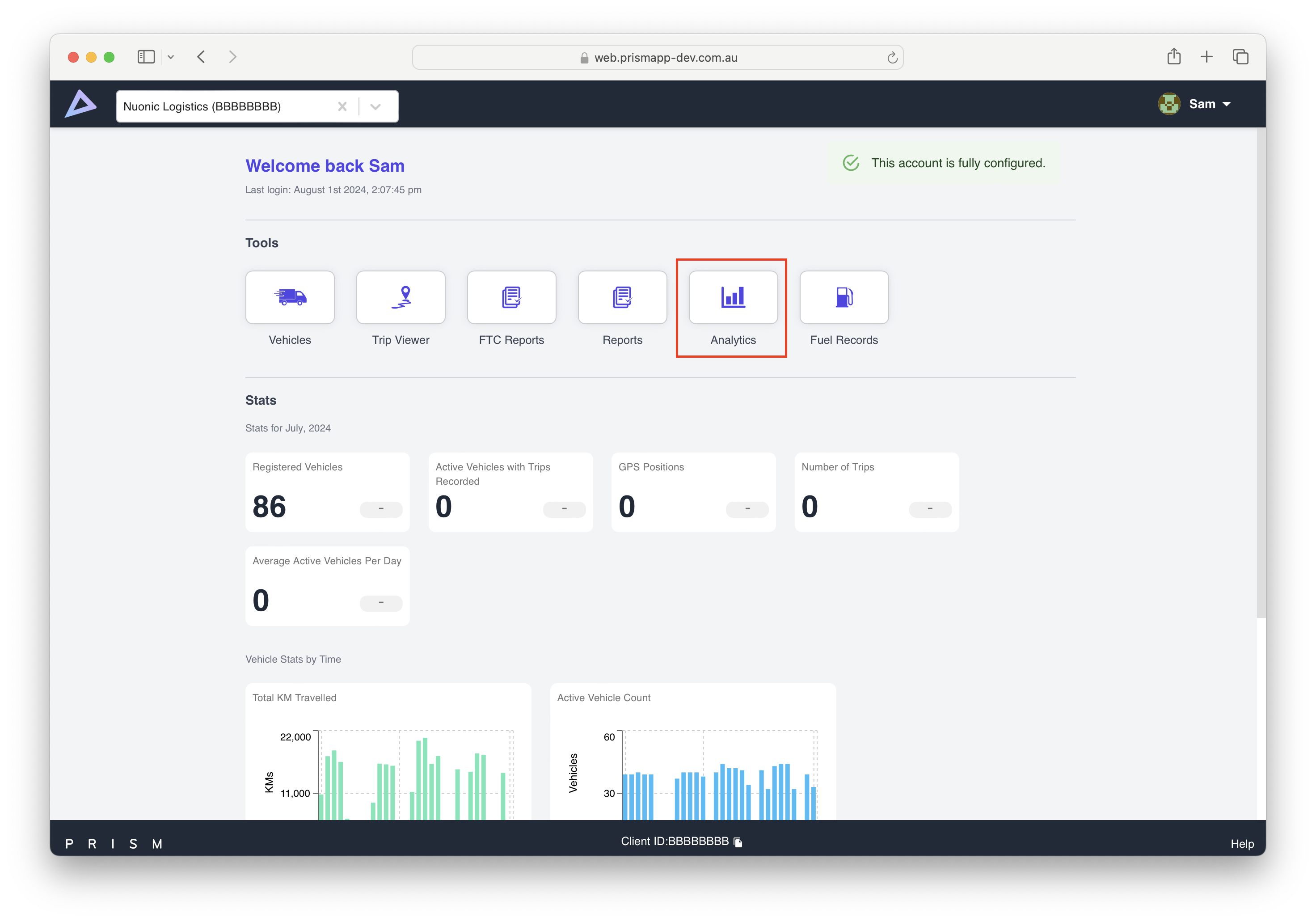
Once you login to your Prism account, navigate to ‘Analytics’ feature on the home page as shown in screen shot below
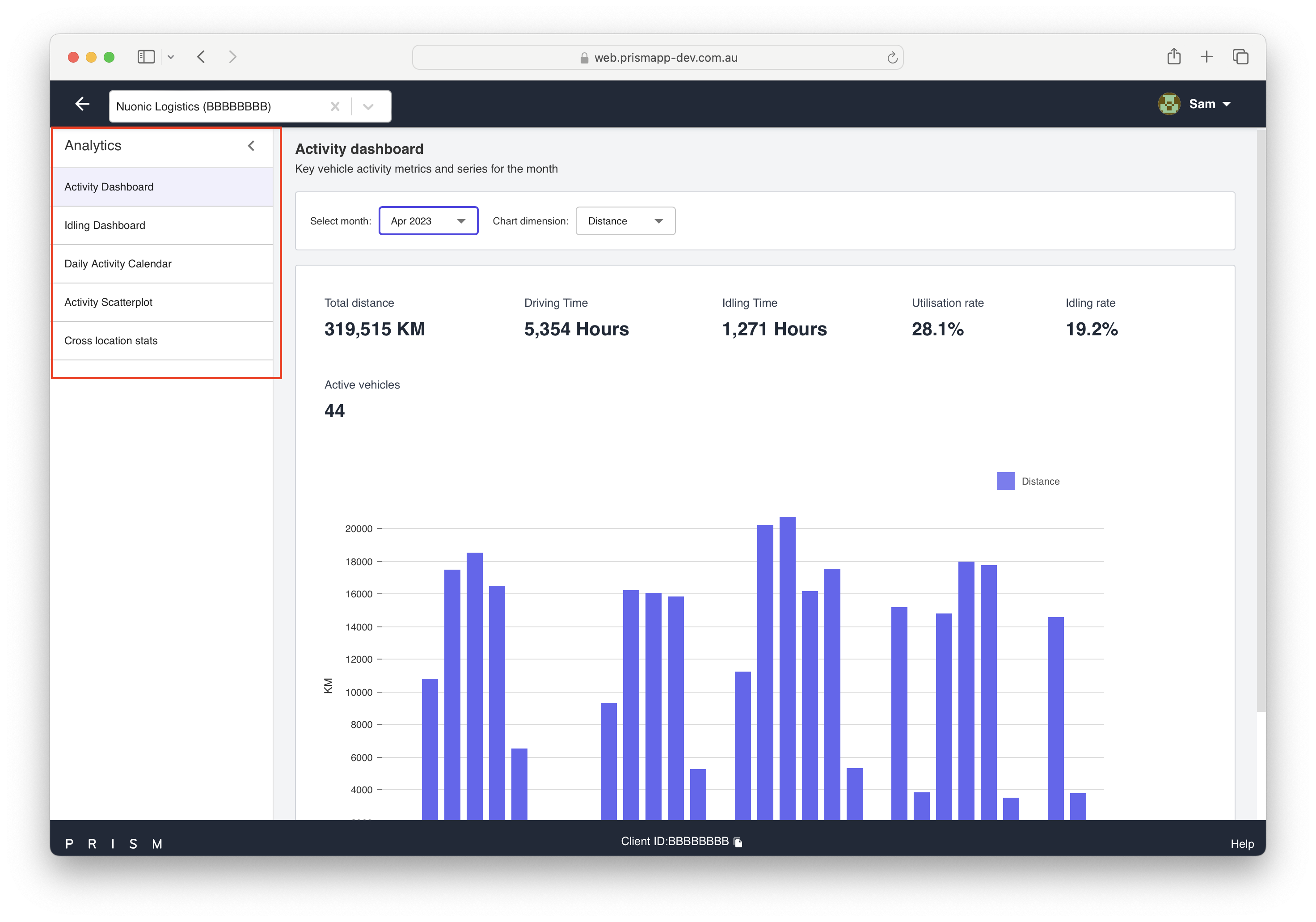
All the available analytics reports can be seen on the left hand pane.
What do these reports mean?
Activity Dashboard:
Interactive graph showing data for each day of the month.
Features include distance, time, utilisation, idling, and vehicle count.
Provides insights into vehicle performance and activities.
Idling Dashboard:
Visualises individual vehicle idling times over the month.
Shows changes and patterns in idling habits.
Daily Activity Calendar:
Displays overall activity and distance covered by individual vehicles on different days.
Select a month to see detailed vehicle activity for that period.
Activity Scatterplot:
Analyses various vehicle activities, such as average speed against average trip distance and idling time percentages.
Identifies correlations and patterns in vehicle behaviour.
Cross Location Stats:
Visualises geographical locations covered by vehicles during a selected month.
Identifies regions with more vehicle activity and overall fleet coverage.